The best spirit wear design ideas usually have one thing in common – people want to wear them long after game day, pep rallies, and fundraiser deadlines are over. That is the difference between apparel that gets stuffed in a drawer and apparel that builds real visibility for a school, team, club, or community group.
For schools and organizations across the Kansas City area, spirit wear works best when it balances pride, comfort, and everyday style. A design can look exciting on a mockup and still fall flat if it feels too busy, too dated, or too tied to a single event. The strongest options are the ones that look good in the stands, in class, at the grocery store, and around town.
Need Custom Printing or Promotional Products?
Zepher Printing helps Kansas City businesses, schools, teams, and organizations with custom apparel, screen printing, embroidery, promotional products, and branded merchandise.
Request a QuoteWhat makes the best spirit wear design ideas work
Good spirit wear is not just about adding a mascot to a sweatshirt. It needs to match how people actually dress. Students want something current. Parents often prefer something clean and versatile. Staff may want school pride apparel that feels polished enough for casual Fridays or event days.
That is why the best designs usually start with a simple question: who is this for? If you are designing for an elementary school fundraiser, the answer may lean playful and bold. If you are building apparel for a high school booster club or district-wide staff initiative, a more refined look often gets better long-term use.
Another practical factor is printability. Some artwork looks great on a screen but becomes muddy, expensive, or hard to read on fabric. Clear lines, readable type, and strong contrast usually hold up better across T-shirts, hoodies, quarter-zips, and performance wear.
12 best spirit wear design ideas to consider
1. Classic mascot front graphic
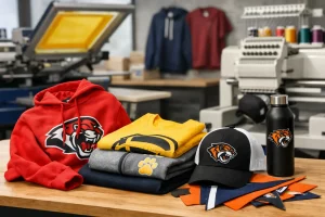
This is the staple for a reason. A strong mascot or school emblem centered on the chest creates immediate recognition and broad appeal. It works especially well for youth sports, elementary schools, and fan gear sold at events.
The key is restraint. A cleaner mascot illustration with solid typography often performs better than an overly detailed design with too many effects. If the logo already carries strong recognition, let it do the work.
2. Vintage athletic lettering
Old-school varsity styling continues to be one of the best spirit wear design ideas because it feels familiar without looking outdated. Think block lettering, arched school names, simple stripes, and worn-in textures.
This style works well for middle schools, high schools, alumni apparel, and booster clubs. It also fits naturally on crewnecks and hoodies, where people tend to want a relaxed, everyday look.
3. Minimal left chest logo with full back print
Not everyone wants a large front graphic. A subtle left chest mark paired with a larger back design gives spirit wear a more retail-style feel. That can make a big difference for staff apparel, parent groups, and organizations trying to reach a wider age range.
This format also gives you room to include a mascot, slogan, year, or event theme on the back without crowding the front. It is a smart option when you want school pride with a cleaner presentation.
4. Typography-first designs
Sometimes the school name is the brand. A bold type treatment can be more effective than a complex image, especially when the organization already has strong local recognition.
Typography-first spirit wear works best when the fonts feel intentional. Athletic block fonts create one impression. Script or collegiate serif fonts create another. The right choice depends on whether you want the apparel to feel energetic, traditional, modern, or premium.
5. Retro color blocking and stripe details
Simple stripe graphics on sleeves, shoulders, or chest panels can make spirit wear feel more like branded apparel and less like a giveaway shirt. This works particularly well for teams, rec leagues, and school stores that want merchandise with a more current look.
There is a trade-off here. More decoration can increase production complexity depending on the garment and print method. Still, when used strategically, stripes and color blocking can give even a basic piece more perceived value.
6. Local pride crossover designs
For some schools and community organizations, the strongest spirit wear connects school pride with hometown pride. A design that references a local landmark, neighborhood identity, or regional theme can create broader appeal among parents, alumni, and supporters.
This approach can work well in places like Overland Park, Olathe, Lee’s Summit, or Liberty, where local identity runs strong. The design should stay subtle, though. It is most effective when it complements the school brand rather than competing with it.
7. Event-specific editions
Homecoming, senior night, field day, tournament runs, and anniversary celebrations all create short-term demand for spirit wear. Event-driven designs can perform well because they feel timely and collectible.
The caution is that event-specific apparel has a shorter shelf life. If budget or inventory flexibility is tight, it may make more sense to combine an event detail with a broader design people will still wear later.
8. Monogram or mascot icon collections
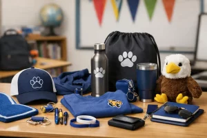
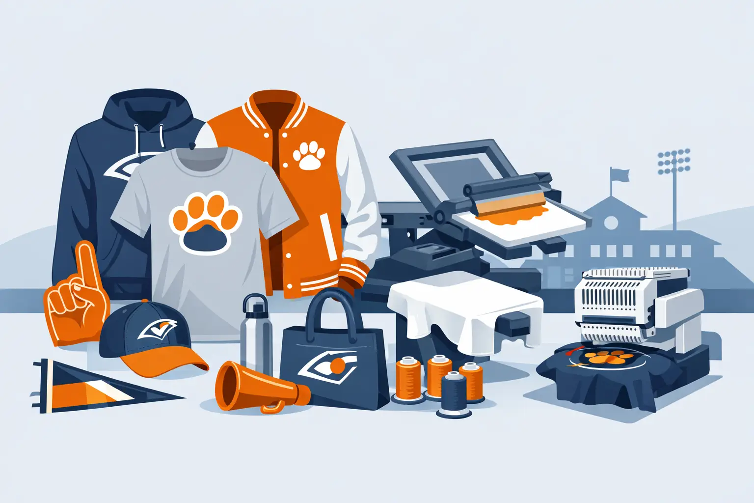
Instead of relying on one full design, some schools and organizations benefit from a small collection of marks – a primary logo, a lettermark, a mascot icon, and a slogan lockup. This gives buyers more variety while keeping branding consistent.
It is a practical strategy for spirit wear programs that serve students, staff, alumni, and families. Not everyone wants the same look, but they still want to feel connected to the same identity.
9. Performance wear graphics
Spirit wear is no longer limited to cotton tees and hoodies. Performance shirts, quarter-zips, lightweight pullovers, and moisture-wicking gear are often popular with coaches, staff, and active families.
Designs for these garments usually need a lighter touch. A large heavy print may not feel right on athletic fabric. Cleaner logos, smaller placements, and sharp contrast tend to work better.
10. Tone-on-tone premium looks
A one-color print on a same-family garment color can create a more elevated result than a bright, high-contrast graphic. This is one of the best spirit wear design ideas for faculty apparel, booster leadership, or school merchandise aimed at adults.
It depends on the audience. Students often gravitate toward bolder contrast. Parents and staff may prefer something more understated that fits easily into everyday wardrobes.
11. Slogan-driven spirit wear
A great slogan can carry an entire design if it feels authentic to the school or organization. Short, memorable phrases tied to team culture, school values, or a mascot identity tend to work best.
This style is strongest when the phrase is already part of the organization’s language. If a slogan feels forced, the design usually does too. Familiarity matters here.
12. Limited-run seasonal designs
Seasonal spirit wear can keep interest high throughout the year. Fall hoodies, winter beanies, spring field day shirts, and playoff-season apparel give supporters new reasons to buy.
This approach is especially useful for booster clubs and organizations running ongoing apparel programs. It creates momentum without requiring a complete brand reset every season.
How to choose the right spirit wear design for your group
The smartest design choice usually comes down to audience, garment, and purpose. If the main goal is fundraising, broad appeal matters more than artistic complexity. If the goal is team identity, the design can be more specific and bold. If the apparel is for staff or community partners, versatility matters more.
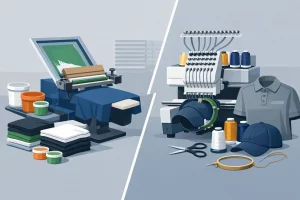
Garment choice should shape the artwork early. A design that works on a short-sleeve tee may not translate well to embroidered polos or quarter-zips. Likewise, a highly detailed illustration may print well on one item and lose clarity on another. Planning the collection as a system instead of one-off pieces usually leads to better results.
It also helps to think about who is actually making the purchase decision. Students influence demand, but parents often complete the order. School administrators may want consistency. Coaches may prioritize speed and function. The best spirit wear programs account for all of those viewpoints.
Common mistakes that weaken spirit wear
One of the most common issues is trying to say too much in one design. A mascot, full school name, slogan, graduation year, sponsor logos, and decorative elements can quickly turn into clutter. Simpler designs usually get worn more often.
Another mistake is ignoring garment quality. Even the best artwork cannot save a shirt that feels stiff, shrinks poorly, or fits awkwardly. People judge spirit wear as apparel first and promotion second.
Color choices can also cause problems. School colors are important, but not every combination translates well to every garment. Some pairings need a neutral base or a secondary accent color to stay readable and flattering.
A practical approach that gets better results
In our experience, the strongest spirit wear programs mix a few dependable styles with one or two fresh options each season. That gives organizations consistency without making the apparel feel repetitive. It also helps avoid the common cycle of over-designing one year and scaling back the next.
If you are planning a new spirit wear launch, start with the designs people will wear most often, not just the ones that look exciting in a sales flyer. Everyday appeal is what builds visibility over time. When the design feels right, the apparel does more than show support – it becomes part of how your school or organization is recognized in the community.